

You run a speed test on your desktop and everything looks fine. Then someone visits your site on their phone and waits five seconds for the homepage to load. Desktop and mobile are completely different environments, and testing only one leaves you blind to real performance problems.
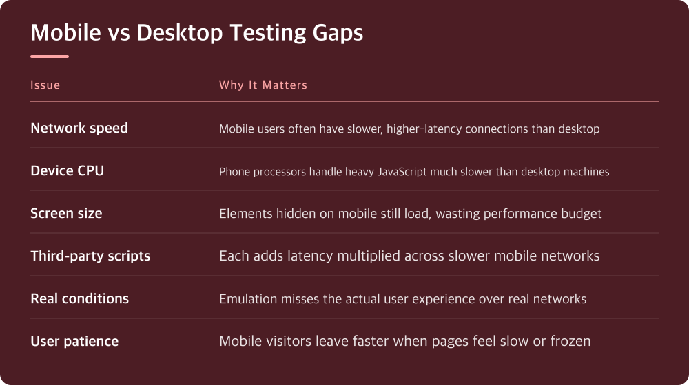
Desktop tests don’t see the network your visitors actually use
When you test on desktop, you’re usually on a fast, stable connection. Your phone might be on 4G with high latency, spotty coverage, or bandwidth shared with ten other devices nearby. A test that shows a 2-second load time on WiFi means nothing if the page takes 8 seconds over a cellular connection.
Desktop browsers also cache differently than mobile browsers. Your test machine might be reusing resources it downloaded weeks ago, while a first-time mobile visitor has to fetch everything fresh. This isn’t a theoretical problem—it’s the difference between a usable experience and visitors closing your tab.
The only way to see what your actual mobile visitors experience is to test on the network conditions they use. Most testing tools have mobile emulation modes, but emulation isn’t testing. You need to test on real devices over real mobile networks, not just simulated slowness.
Your desktop CPU is much faster than a phone’s
Even a mid-range phone from three years ago processes pages slower than your development machine. When you test on desktop, large JavaScript files parse and execute instantly. On a phone, that same file might lock up the main thread for half a second while it runs, making the page feel frozen.
Images also matter more on mobile. Your desktop might resize a 4MB photo to fit the screen instantly. A phone with less RAM and a slower processor struggles with that same task. Using properly sized images for mobile isn’t a nice-to-have—it’s the difference between a fast site and a slow one.
Battery drain compounds this problem. A phone running JavaScript hard will drain battery quickly, and users notice. They’ll bounce before they consciously register slowness. Test with real device performance in mind, not theoretical optimal conditions.
Mobile users have less screen space and patience
A slow desktop site is annoying. A slow mobile site is a reason to leave. Mobile visitors are usually multitasking—they check your site while doing something else and expect instant responses. They don’t have the screen real estate to see your content while waiting for assets to load.
Viewport size changes how your CSS and JavaScript behave. A desktop media query might be hiding elements that load fine on a big screen. On mobile, those same hidden elements still load in the background, slowing down the page, but the user never sees them. You’re paying the performance cost for nothing.
Progressive enhancement matters more on mobile. A progressive web app or graceful fallback that serves critical content first can mean the difference between a usable site and a completely blocked experience. Desktop performance hides these problems because even with slow downloads, the page becomes interactive quickly enough.
Third-party scripts hit mobile much harder
Analytics, chat widgets, ads, and tracking pixels don’t care what device you’re on—they all load. On desktop with extra CPU and bandwidth, the impact is subtle. On mobile, a single third-party script can block page rendering for seconds.
Each third-party script is a separate HTTP request, and mobile networks have higher latency. That means each request takes longer individually. Load five third-party scripts on mobile and you’re waiting for five round trips over a slower connection, not one fast one.
Start testing with your actual third-party stack loaded. If you only test with a stripped-down version of your site, you’re not seeing what visitors see. Check what tracking and ads are running, then load them in your mobile tests. This is where you’ll usually find the biggest performance problems.
Test on devices your actual visitors use
Borrowing an iPhone from someone else is better than no mobile testing, but random devices don’t tell you much. Check your analytics to see what phones are actually visiting your site. Test on one low-end Android phone and one recent phone. This gives you a real range of performance.
Use your site on 4G (or whatever mobile network is common where your visitors are) for at least one full test. Throttled WiFi simulation isn’t the same thing. Sit with your phone for five minutes and load your pages like a real user would, clicking through to different sections.
Pay attention to how the page feels during load, not just the final load time number. Does it feel frozen? Does text shift around after it loads? Can you tap buttons before they’re ready? These moments of jank are why mobile users leave, and desktop testing completely misses them.
Start optimizing for mobile today
Stop relying on desktop testing as your proxy for mobile performance. Open your site on your phone right now, over whatever network you normally use, and spend two minutes just using it. Notice where it feels slow or clunky. That’s your starting point.
Make one change based on what you found: compress an unoptimized image, defer non-critical JavaScript, or remove a slow third-party script. Then test on mobile again and see if it matters. One small real improvement on mobile is worth more than obsessing over milliseconds on desktop.
Set up regular mobile testing as part of your workflow. Your hosting provider usually has performance tools in the control panel—check what they offer for mobile testing. Many of those tools have free tiers that are good enough for regular checks. The key is making it routine, not occasional.
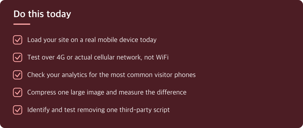
Do this today
- Load your site on a real mobile device today
- Test over 4G or actual cellular network, not WiFi
- Check your analytics for the most common visitor phones
- Compress one large image and measure the difference
- Identify and test removing one third-party script
※ This is informational and not a recommendation of any specific product or company.